Thursday 3 November 2022

Scotland's Renewable Energy Statistics

Summary

Full Fact have concluded that senior SNP politicians have been guilty of making false statements to suggest that Scotland is close to self-sufficient in renewables (see here and here).

Nowadays - to avoid being accused of making blatantly false claims - the SNP are generally careful to include the qualifying phrase "the equivalent of" when making statements about the extent to which Scottish renewables meet Scotland's electricity demand. But as Full Fact have also made clear, this phraseology is still misleading:

The SNP are clearly wedded to this misleading statistic - take just three recent examples:

  • Responding to Full Fact: "A Scottish Government Spokesperson said: Scotland has a hugely positive story to tell in renewables, which provided the equivalent of 96% of Scotland's gross electricity consumption in 2020"

  • Nicola Sturgeon correcting the record in Holyrood: "Corrected text: Under this Government, the equivalent of 98.8% of our gross electricity consumption is already provided by renewable energy sources."

  • Ian Blackford in Parliamentary Debate: "and nearly 100% of the equivalent of our electricity consumption already comes from renewables <interruption> ... I ... you know I've said equivalent on many occasions but I thank the right honourable gentleman for that [...] I think if the honourable gentleman checks Hansard he'll find that I've said that on a number of occassions"


As an aside: it's easy to check Hansard and in fact Ian Blackford has never used the "equivalent" qualifier in this context (see here) but he did make the false, unqualifed claim in September (see here); "almost 100% of our entire electricity production comes from renewables. That is not attention-seeking, I would say to the Prime Minister; these are the facts."

To illustrate why quoting only the "equivalent of " statistic is highly misleading, the following figures all come from the same Scottish Government source for 2020 and are internally consistent:

  • Scotland was capable of meeting all of its electricity demand from renewable generation just 51.1% of the time

  • 55.7% of electricity consumed in Scotland came from renewables

  • The equivalent of 98.8% of Scotland's gross electricity consumption was generated by renewables [this is the figure the SNP keep quoting]

Using the same source we also know the figures for 2021 (with one caveat) and in all cases the most recent year's figures are lower:

  • Scotland was capable of meeting all of its electricity demand from renewable generation just 37.8% of the time [this is the figure quoted by Full Fact above]

  • 52.8% of electricity consumed in Scotland came from renewables

  • The equivalent of 82.9% of Scotland's gross electricity consumption was generated by renewables [a figure which was briefly published and subsequently deleted, see below]

Looking at the figures above it's obvious why the SNP are so fond of the 2020 "equivalent of" figure. What is perhaps less obvious is how the first two measures above can be consistent with that figure. This blog seeks to clarify the confusion caused by these different measures and to explain why the first two measures give a clearer "real world" picture.

It should be clear from these figures that anybody with the impression that Scotland is close to being self-sufficient in renewables has been seriously misled. 


Explaining the Figures

Scotland's First Minister was recently compelled to correct the official record following an FOI request from Sam Taylor of These Islands. The correction (found here) was as follows:

Original text: Under this Government, we have a position where our net energy consumption is already provided by renewable energy sources.

Corrected text: Under this Government, the equivalent of 98.8% of our gross electricity consumption is already provided by renewable energy sources.

The introduction of 98.8% and the switch from net to gross are distractions, the key amendment doing all the heavy lifting is the introduction of the words "the equivalent of".

To explain what's going on here we need to understand three different measures, each of which tells us something different about the extent to which Scotland's renewables energy generation matches Scotland's electricity demand

  1. The equivalent of gross electricity consumption met from renewables: this simply takes total renewables electricity produced through the year (including electricity exported) and divides it by total electricity consumed in Scotland in the same year; it takes no account of whether the electricity was being produced when it was needed in Scotland

  2. Proportion of electricity consumed from renewables: this shows how much electricity consumed in Scotland actually came from renewables. It's a far lower figure because it reflects the reality of demand vs supply variation; if Scotland needs more electricity than renewables can provide at the time it's needed then non-renewable generation is used 

  3. Proportion of time when Scotland is capable of meeting demand from renewables: this is the harshest measure of "self-sufficiency" as it counts only those half-hour periods where Scotland's renewables generation exceeds demand.
[If these measure still seem confusing, the appendix below provides some simple worked examples] 

We can look at each of these measures as shown on the Scottish Government's "Energy Statistics Hub".

Measure 1: in 2020 the equivalent of  98.8% of gross electricity consumption came from renewable sources [found here]


This is the figure relied upon by the First Minister's correction above. Note this figure is for 2020 despite it now being November 2022.  Interestingly the figure for 2021 was briefly published but has since been deleted - credit to @PantoPolitics for grabbing the screencap below before the 2021 data was removed


That this showed a material decline in 2021 is not a surprise: the same data source shows us that significantly less electricity was generated from renewables in 2021 than in 2020 (it simply wasn't as windy).


The decline in the headline "equivalent of" percentage is certainly politically unhelpful to the SNP, but as the figure remains unpublished, they are free to keep using the out-of-date 2020 figure. What is curious is that an initial view of the 2020 data (showing an increase on the prior year) was made available in March 2021:


But in November 2022 the data for 2021 (which we know will show a decrease on the prior year) has not been published. Readers are free to draw their own inference from this observation.

Measure 2: in the 12 months to September 202263.1% of electricity that Scotland consumed came from renewable resources [found here]

That figure is also available for past calendar years so we can see that in 2021 it was 52.8% and in 2020 it was 55.7%


Measure 3: in 2021 Scotland was capable of meeting demand from Scottish renewables generation 37.8% of the time [found here]


As we can see from the green line on the graph above, that figure was down from 2020 (when it was 51.1%).

For the avoidance of doubt: the light orange line shows that when Scotland's Nuclear and gas generation capacity is included, Scotland is effectively self-sufficient in electricity generation - but we are most definitely not close to self-sufficient when it comes to generation from renewables.

It is perhaps also worth noting that the SNP are resolutely opposed to nuclear generation (nuclear being the gap between the green and blue lines above).

So to summarise using the figures for 2021:

  • Scotland was capable of meeting all its electricity demand from renewable generation just 37.8% of the time 

  • 52.8% of electricity consumed in Scotland came from renewables

  • The equivalent of [roughly] 82.9% of Scotland's gross electricity consumption was generated by renewables [a figure which was briefly published and subsequently deleted]


Appendix: Explaining how the measures differ

Having discussed these measures with many smart and well-informed people, it's clear that it's easy to get confused about what the different measures mean. To explain how the three different measures vary, it's helpful to illustrate with some simple theoretical examples of supply/demand matching.

Let's start with a very simple extreme example where, over a 12-period timescale, renewables always meets 50% of demand:


In this illustration:
  • Measure 1: the equivalent of 50% of electricity consumption is met by renewables
  • Measure 2: 50% of electricity consumed came from renewables
  • Measure 3: renewables were capable of meeting demand 0% of the time

Now let's try another extreme example, where half the time renewables fully meet demand, half the time there is no renewables generation:


In this illustration:
  • Measure 1: the equivalent of 50% of electricity consumption is met by renewables
  • Measure 250% of electricity consumed came from renewables
  • Measure 3: renewables were capable of meeting demand 50% of the time

Now let's consider something a bit more variable (but with supply still never exceeding demand):

In this illustration, 73% of the graph is green so:
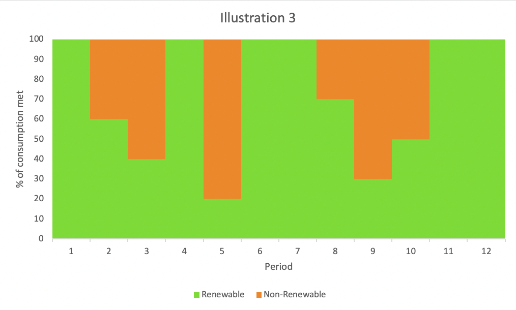
  • Measure 1: the equivalent of 73% of electricity consumption is met by renewables
  • Measure 2: 73% of electricity consumed came from renewables
In 6 of the 12 periods renewables fully met demand so:
  • Measure 3: renewables were capable of meeting demand 50% of the time
As a final illustration, lets consider the more realistic scenario where renewables generation exceeds demand in those periods where 100% of demand can be met from renewables:


In this illustration
  • Measure 1: the equivalent of 83% of electricity consumption is met by renewables (the total green area would fill in 83% of the area under the 100% of demand line)

  • Measure 273% of electricity consumed came from renewables (this is the same as the previous illustration because renewables production which exceeds demand does not contribute to this figure)

  • Measure 3: renewables were capable of meeting demand 50% of the time (6 out of 12 periods)

In reality, each time period would have a different absolute level of demand, so the maths gets a little more complicated - meeting demand when demand is low has less impact on measures 1 and 2 than meeting demand when demand is high (although measure 3 is unaffected by this issue). I could draw another graph, but I think we've probably gone far enough to explain the dynamics at play here.


ADDENDUM [added 04/11/2022]

The difference between "when the wind blows" and "when we need electricity" is clearly an important factor in this debate, so I went hunting for the data and found what I wanted on the National Grid Data Explorer.

The "Demand Data Update" provides actual half-hourly data for (amongst other things) National Demand and Embedded Wind Generation.  That Embedded Wind Generation is not all wind generation*, but it provides us with data on variability of wind generation for the same half-hourly periods that we have data for National Demand. 

Armed with this data we can create indices of electricity demand and wind generation where both average to 100.  This gives us an illustrative graph where the equivalent of all demand is met by wind generation while reflecting the actual variability of that supply and demand during the month of October 2022:


So when the graph is brown demand is met by wind supply, when it's green wind supply exceeds demand, when it's red demand is not met by wind supply. Note: while this is based on real UK demand and wind supply profiles (on a half-hourly basis) it is indexed to illustrate a position where the equivalent of demand would be met by wind supply.

The Graph illustrates quite neatly that electricity demand and wind energy supply are not correlated - having the equivalent of enough wind generation to meet demand is not the same as supply actually matching demand when it's needed.

This is of course why developing economically viable and scaleable storage solutions for periods of excess reneweables generation is so important (e.g. pumped, battery or potentially Hydrogen storage - see here). But it also shows why wind generators in Scotland benefit from direct access to the larger pool of demand that comes from being part of a fully-integrated GB energy market - placing a border between excess renewables supply and demand for that renewables capacity helps nobody (and can only hinder progress to Net Zero). 

******

* "This is an estimate of the GB wind generation from wind farms which do not have Transmission System metering installed. These wind farms are embedded in the distribution network and invisible to National Grid. Their effect is to suppress the electricity demand during periods of high wind. The true output of these generators is not known so an estimate is provided based on National Grid’s best model. Note that embedded wind farms which do have Transmission System metering are not included in this total."


Saturday 3 September 2022

Ofgem Price Caps and Scotland

Recent actual and future forecast increases in Ofgem's default energy tariff cap levels are genuinely shocking and have rightly led to widespread calls for government action to deal with an impending national energy bills crisis. 

But in Scotland there is - of course - an inevitably parochial spin being placed on the issue, particularly by those who seek nationalist grievance at every turn.  Take this headline in the independence-supporting newspaper The National:


Quite how they claim that they have an "exclusive" on Ofgem's latest published price caps I don't know. Read the article itself and you'll find SNP international trade spokesperson Drew Hendry asserting that this standing charge difference is "plainly wrong" and this bizarre graph which is presumably intended to illustrate the issue:

This graph commits so many crimes against good data presentation that it is worse than useless;
  • The bar chart is pretty much meaningless -  it mixes a pence per day figure for the standing charge with a pence per kWh figure for the unit cost. You can't stack measures in two different units together; the left hand scale can't be two different things
  • The only way that bar chart could make sense would be if you wanted the left hand scale to be in pence per day, in which case the bar chart as drawn would be showing the cost per day for a household using one kWh per day - but the typical average consumption figure used by Ofgem works out at over eight kWh per day. So the bar chart implicitly shows the daily electricity costs for somebody with 1/8th of typical electricity consumption
  • The green 'typical consumption annual bill' line is hard to read and relates to a right hand scale which is not zero-based - this exaggerates the variance in 'typical consumption' annual bills which is in fact just +/- 3% vs the national average
  • There is no logic I can see to the left-to-right ordering on this chart ... but squint and look closely at that green line and you'll see that, for typical consumption levels, Northern Scotland's annual bills are marginally lower than London's and Southern Scotland's are almost identical. 
So let's unpick this.

First of all the headline claim is technically correct: from October 2022 the standing charge cap [or to be precise, the "standard credit single-rate metering electricity nil consumption tariff cap"] for Northern and Southern Scotland will be £199 and £198 pa respectively vs London's £134 and a national average of £182. So it will (continue to be) roughly 50% higher than London's (by far the lowest in the UK) and 9% higher than the national average.

But on what basis does Drew Hendry assert that this is "plainly wrong"?

I imagine that before opining so robustly on the subject he will have looked at Ofgem's "default tariff cap model" (the second subsidiary document here). This breaks down the components of the tariff cap by region and shows that the differences between Scotland and London are almost entirely explained by the component that relates to Network Costs


Presumably Hendry would then have looked at the analysis behind those Network Costs as explained by Annex 3 (the fourth subsidiary document here). He'd then have seen that (for the nil use case) this figure is made up entirely of a Distribution Use of System (DUoS) charge.


I haven't personally dug any deeper into these DUoS charges, but it seems pretty obvious that the costs of building and maintaining an electricity network to serve remote, low population density areas would be higher on a per customer basis than it would be for areas of higher population density (like London, for example).

As it happens there is a consultation under-way into possible reform of the DUoS system charges. Given that SNP spokeperson Drew Hendry seems so sure that the current charging system is "plainly wrong", I was disappointed (although unsurprised) not to find the Scottish Government among the 26 bodies who have bothered to respond to Ofgem's consultation request on this subject (see "Response Documents" here).

Perhaps it's easier to just assert something is "plainly wrong" than it is to engage with why the charging system is as it is and to actually get invoved in a constructive debate about how it might be changed. At the risk of stating the obvious: if the DUoS charging system reflects a fair allocation of true regional network costs-to-serve, Scotland becoming independent wouldn't magically change that.

But why this obession with the electricity standing charge anyway? The latest price cap increase has seen the standing charge increase by just 2% whereas typical overall average annual bills are increasing by 70%.

The obvious reality is that most people's energy bills, just as with their phone or water bills, are made up of a combination of standing and usage charges - and that usage charge price rises are the big issue here.

So to decide if Scots are hard done by under of Ofgem's price cap regime, we need to look at total capped electricity costs per kWh for different usage levels. 


This simple graph is hard to read because the differences in capped electricity charges between the Scottish regions, London and the GB average are in reality so small. The graph shows the standing charge differences (the very left-hand edge of this graph) in context, that at typical usage levels actual bills are almost identical and that at higher usage levels bill-payers in London pay more.

The cost of energy crisis is very real and massively concerning - but only the most myopic of Scottish nationalists could make this about a grievance between bill payers in Scotland and those in London.

For completeness, it's easy to repeat the same graph for Ofgem's gas bill price caps:


The standing charge price cap for gas is the same for all regions (and has only risen by 1% at this latest review) - and for what it's worth Londoners pay ever so slightly more than Scotland or the GB average for the same usage.

Anybody reacting to the current energy cost crisis by focusing on standing charges and/or trying to create grievance about the way Ogem is treating Scotland is very much missing the point. 


Wednesday 24 August 2022

GERS 2022 - Here we go again

Every year the Scottish Government's Chief Economist publishes the Government Revenue and Expenditure Scotland (GERS) report and every year the SNP's spin machine goes into over-drive. This year is no exception. 

In 2014 when looking back on years when oil revenues had been booming, the SNP summarised the GERS figures thus: 
"Scotland accounted for 9.3% of UK public spending between 2008-09 and 2012-13, while generating 9.5% of tax receipts - it put in more than it got out."

We can easily update the SNP's previously preferred formulation with the most recent GERS figures:

"Scotland accounted for 9.2% of UK public spending between 2017-18 and 2021-22, while generating 8.0% of tax receipts - it got out more than it put in."

So on the SNP's own terms, Scotland 'gets out more than it puts in' to the UK - and the amount it gets out now is far greater than the amount it used to put in.

This will come as no surprise to regular readers of chokkablog (eg. see last year's write-up as published by These Islands which I'll update in due course). 

Really all you need to know is this simple fact (as included in the Scottish Government's own GERS release summary):

"Total expenditure for the benefit of Scotland by the Scottish Government, UK Government, and all other parts of the public sector was £97.5 billion. [..] This is equivalent to 9.2% of total UK public sector expenditure, or £17,793 per person, which is £1,963 per person greater than the UK average."

So a fair summary would be as follows: Scotland's 8.1% of the UK population generates very close to its population share of revenue but benefits from a far higher share of spending. This is evidenced by the fact that Scotland enjoys £2k higher public spending per head than the UK average (something which by definition has nothing to do with expenditure items which are allocated across the UK on a per head basis). 

So let's look at how the SNP are trying to spin their way out of this on the day of publication.

Senior SNP politcians can't lower themselves to the level of GERS-denying cybernats because:

  • The decision to publish the GERS report is the Scottish Government's alone [as confirmed by this FOI response]
  • GERS is compiled by the Scottish Government's own team of statisticians and economists (in St Andrew's House, Edinburgh) using methodologies and assumptions they have chosen following years of extensive consultation 
  • GERS is an accredited National Statistics publication and carries the quality mark to prove it 

So what do they do? Well this appears to be at least one of the preferred lines, as pushed by the Deputy First Minister and the SNP's "head of broadcast media" on Twitter:


This is not a new line - it was being pushed in a slightly different form by Andrew Wilson last year - but it is at best hugely misleading and at worst a downright lie.

First let's check the claim on its own terms.

  • Revenues raised in Scotland (without North Sea receipts): £70,311m [Table S.3]
  • Total devolved current expenditure: £53,546m [Table 3.8a]
  • Total devolved capital expenditure: £8,035m [Table 3.8b]
  • Total reserved social security expenditure (aka Social Protection): £16,730 [Table 3.8a]
Now you don't need to be a mathematical wizard to be able to calculate that the difference between the revenue and expenditure figures listed above is a deficit of £8,000m.

Both Swinney and Geddes are explicitly referring to all (or in Geddes' case "ALL") devolved expenditure and yet it's clear that, for their statement to make any sense at all, they have to exclude devolved capital expenditure.

A journalist friend has shared the contents of the SNP's press release which inlcudes a quote from Swinney making basically this same claim but using the term "day-to-day devolved spending". The press release is, in these narrow terms, technically correct (ie. where "day-to-day" implies current expenditure only) but the public claim made in these high profile tweets is unequivocally false.

But there's more: the claim is clearly intended to signal that 'the taxes we raise in Scotland cover our spending', but even with the "day-to-day spending" caveat this is egregiously misleading.

There are two ways to think about the reserved spending that (in addition to devolved capital spending) is not covered by taxes currently raised in Scotland.
  1. We can look at what the Scottish Government's own economists think is our fairly attributed share of reserved expenditure (including defence, debt interest, overseas aid and shared machinery of state). This is precisely what GERS does and it shows this figure to be £19,180m (per Tables 3.8a and 3.8b) 

  2. Alternatively we can look at how much of reserved expenditure which is excluded by the SNP's claim actually takes place in Scotland
The first of these is straightforward and is covered in part by this excellent Fraser of Allander blog:

"What this does not include is any capital investment, of course, including £8bn of devolved capital expenditure. More significantly, there are a number of reserved functions that are also funded outwith these 2 categories – including reserved economic development spending of £2.2bn (so on programmes like Innovate UK), public sector debt interest payments (£4.5bn), reserved transport spending (£988m), public and common services (£1.4bn – including running administrative services such as HMRC), defence (£3.9bn), International services (£659m – including foreign aid) etc."

GERS quite sensibly takes a 'for Scotland' approach when attributing expenditure, but this is often used by nationalists as a way of dismissing the numbers as 'mere allocations'. Suffice to say that to ignore those expenditure items is to assume an independent Scotland would have no expenditure on defence or international development aid, would take £2bn out of enterprise and economic development spending, would renege on all debt responsibility and be able to function without the basic machinery of state like HMRC, DWP, HMT, Home Office, overseas trade and diplomatic presence etc.

An alternative approach would be to look at what reserved expenditure takes place in Scotland (but that is completely ignored in the statements made by Swinney, Geddes et al). These are not the only other costs an independent Scotland would incur (think debt interest and overseas development aid for example) but they relate directly to employment, economic development, rail services and tax generated in Scotland today.

The detailed analyses which underpin the following conclusion have been shared with the Scottish Government economists and statisticians who are responsible for compiling GERS. They confirmed that the issue of spending in Scotland, as opposed to for Scotland, is an area of research that they had intended to take forward, as was set out in their Scottish Economic Statistics Work Plan; however, due to Covid-19 they have not been able to progress this work. In the absence of complete analysis of their own on this topic, they are understandably not able to comment on the accuracy of our final calculations – but having reviewed the analysis in this paper, they were able to confirm that the detail behind the starting point of spending for Scotland has been correctly interpreted.

The simple summary (full detail and sources are on Chokkablog here) is as follows:

In addition to social protection (inc pensions), there is a futher £7 billion of reserved spending that takes place directly in Scotland.

This is made up by c.£4.7 billion of non-defence related reserved spending incurred directly in Scotland;

  • £1,012m - Civil service costs relating mainly to the 8,260 DWP and 7,850 HMRC employees who are based in Scotland, as well as other reserved departments where employees are located in Scotland
  • £884m - Network Rail (maintaining and improving Scotland's rail infrastructure)
  • £726m - Renewable Obligation Certificates* (support for Scotland's renewable power industry)
  • £676m - Research Grants awarded to and spent in Scotland as well as the Renewable Heat Incentive 
  • £529m - R&D tax credits and other tax reliefs supporting economic activity in Scotland
  • £273m - Nuclear decommissioning costs in Scotland
  • £251m - BBC costs (in Scotland)
  • £125m - Scottish Ferries costs and Creative/Historic Scotland costs recharged to the rest of the UK in GERS
  • £70m - HMCTS central, British Transport Police, CICA Agency
  • £36m - Environment Protection costs
  • £118m - Other spending in Scotland, including elements of: Maritime and Coastguard Agency, UK Space Agency, Electricity Settlement Company, Broadband Voucher Scheme, CITB/ECITB; Lottery Grants; Medical Research Council; etc.

In addition to the above non-defence spending in Scotland, roughly £2.5 billion of defence spending takes place in Scotland.

So the SNP's spin ignores £8bn of devolved capital expenditure and c£7bn of other reserved expenditure that takes place directly in Scotland as well as Scotland's £6.9bn share of debt interest and £0.7bn share of international expenditure. 

This is not the messaging of a party who are serious about making an honest economic case for independence.


* This figure understates the true scale of the effective transfer from rUK to Scotland, as explained here: "the annual net flow into Scotland has been growing steadily, and now totals at least £1.2bn per annum. In 2019/20, subsidies for generation accounted for £730m and support for transmission £469m."


Tuesday 28 June 2022

Why Not Scotland?

Despite the fact that recent opinion polls (eg. here and here) show that less than a third of Scots actually want it, Nicola Sturgeon has today announced that we are to be treated to a "pretendyref" on Scottish independence in October 2023. 

Given that nobody expects the UK Government to grant a Section 30 order, this will become a glorified opinion poll which pro-union voters will be inclined to boycott, rendering it unrepresentative and therefore entirely pointless.

But having set a date, presumably the SNP believe that they can now articulate a credible case that will win round those indy-curious voters who worry about the economic consequences of breaking up the UK. 

Which is curious, because just last week the Scottish Government published the first episode in their new and improved independence prospectus serialisation - and if this was intended to be a teaser for what is to come, it turned out to be a less than enticing flick of the Kimono. 

The Scottish Government's "scene-setter" paper compares the UK to a hand-picked selection of European comparator countries. Unfortunately it doesn't include any data for Scotland and skirts around the question of how different countries approach the trade-off between tax and spend.

This blog post's appendix walks through the journey from the bar charts presented by the Scottish Government to a more complete and informative presentation of comparative country data. But you don't need to travel that full journey to appreciate the view we reach at the destination: this simple chart compares the fiscal position of Scotland (in the UK) with all European OECD countries:


This clearly shows what the Scottish Government's paper failed to address: some combination of higher taxes and/or lower spending would be required for an independent Scotland to achieve fiscal sustainability (ie. to move up and/or to the left on the graph and get within the EU's 3% excessive deficit threshold).

In fact these international comparisons neatly illustrate that the UK's pooling and sharing of tax revenues allows Scotland (in the UK) to benefit from levels of government spending that would otherwise be unsustainable without significantly higher taxes in Scotland. 

Those who attempt to obfuscate this debate by questioning the validity of the data for Scotland are arguing with National Statistics published by the Scottish Government and don't deserve to be taken seriously. 

Those supporters of Scottish independence who do wish to be taken seriously need to explain how the revenues raised by the government of an independent Scotland could increase and/or how the cost of public services consumed could decrease relative to these "in the UK" figures. 

We can immediately see from this chart that tax revenues would need to increase and/or public spending decrease by c.6% of GDP just to get within the EU's 3% excessive deficit threshold and achieve the SNP's stated aim of being, in fiscal terms, "just like a normal independent country" (of whatever size).

All the countries on that chart have established currencies (or did so as pre-conditions of joining the EU and/or the Eurozone). An independent Scotland would no longer be in a formal Sterling currency union and we are told a new Scottish currency would be created as soon as practicable. That realistically means some combination of fiscal and/or current account surplus would be required.

Even if we just look at the countries the Scottish Government hand-picked as comparators, plenty of them run a fiscal surplus in normal times so, to coin a phrase, why not Scotland? 

To run a fiscal surplus would (on these pre-pandemic figures) require tax rises or costs savings of 9% of GDP. That is the equivalent of a 20% decrease in total government spending or a 24% increase in total government revenue.

To help those trying to make these numbers stack up, let's put 6 - 9% of GDP in the context of some existing Scottish revenue figures as % of GDP ...
  • Income tax: 7.3%
  • National Insurance: 6.4%
  • VAT: 6.1%
  • Onshore Corporation Tax: 1.7%
  • Tobacco & Alcohol Duties: 1.3%
... or specific Scottish spending figures:
  • Social Protection (inc Pensions): 13.5%
  • Health: 7.7%
  • Education and Training: 5.2%
  • Public Sector Debt interest: 2.9%
  • Defence: 1.9%
So the exam question for the SNP is a simple one: with reference to these current tax and spend figures, how would you achieve fiscal sustainability let alone the surplus position most of your chosen comparator countries achieve?

***

None of this is to deny the fact that historical actual figures can only represent Scotland as an integral part of the UK - the question is what would those reserved policy decisions and reserved spending allocations be replaced by?

The SNP's Sustainable Growth Commission suggested addressing the fiscal conundrum by simply reducing government spending as % of GDP (a policy more commonly referred to as "austerity") - but in doing so they failed to address any of the following rather important questions:

  1. Many significant tax and spend decisions are currently considered to be best made on a UK-wide basis and are therefore reserved to Westminster; what different decisions might an independent Scotland make in areas such as income tax, VAT, corporation tax, social welfare spending etc. and what would the realistic net fiscal result be?

  2. In answering the above, what consideration has been given to the likelihood of capital and talent flight associated with higher tax-rates and currency uncertainty?

  3. Some reserved UK spending is considered to be of equal value to all parts of the UK and so is allocated on a population basis. Compared to these allocated figures, what levels of expenditure would an independent Scotland commit to in areas such as defence and international development aid and what would it cost an independent Scotland to replicate and run what is currently the UK's shared machinery of state (e.g. HMRC, DWP, Home Office, Border Force, Treasury, etc.)

  4. In answering the above, what consideration has been given to the defence spending requirements of NATO membership and the practical economies of scale when it comes to institution building (i.e. would stand-alone Scottish HMRC, DWP, Home Office, Border Force, Treasury etc. functions cost more or less than the 8.2% of the total UK cost of these institutions which is allocated to Scotland today?)

  5. Scotland has 8.2% of the UK's population but 10.0% of the UK's civil service jobs are based in Scotland. Given that in reserved functions such as DWP, HMRC, MoD, DfID and OFGEM  (costs of which are allocated on a population share basis) significantly more than Scotland's population share of staff are located in Scotland, what assumption is made about the future of those jobs and any related fiscal multiplier effects?1

  6. There are other costs incurred in Scotland which are not charged to Scotland in these spending figures - for example 29% of Scottish Government ferries costs are allocated to the rest of the UK and nuclear decommissioning costs in Scotland are shared with the rest of the UK on a population share basis - what assumption is made about who bears those costs in the future? 

  7. The Growth Commission and the Scottish Government both cite and therefore presumably accept analysis which suggests Brexit-related trade friction will harm UK GDP growth. Given that 60% of Scotland's exports go to the rest of the UK, what assumptions are being made about the impact on Scottish GDP of trade friction resulting from the creation of a Scotland/rUK border? 

  8. Having answered all of the above, what is the realistic outlook for an independent Scotland's fiscal deficit over time - and with what implications for Scotland's cost of debt and ability to build currency reserves?

Where the Sustainable Growth Commission suggested reducing spending as a % of GDP, this latest Scottish Government paper hints at increasing taxes2.  Whichever approach would be taken - and the scale of the challenge points towards both spending reductions and tax increases being required - it is hard to avoid the conclusion that the real-world implications for the people of Scotland would be eye-wateringly painful. 

The fiscal challenge an independent Scotland would face is the elephant in the room - if the SNP are serious about a referendum in 2023, they must address it.


***

NOTES

1. See Civil Service Statistics, all in the context of Scotland's 8.2% share of the UK population:

45,650 or 10.0% of the UK's 456,420 civil servants are based in Scotland, including in reserved functions:

  • 8,260 DWP employees, 10.5% of the UK total
  • 7,800 HMRC employees, 12.2% of the UK total
  • 3,600 MoD employees, 9.7% of the UK total
  • 950 DfID employees, 36.0% of the UK total
  • 370 OFGEM employees, 37.8% of the UK total


2. See Independence in the modern world. Wealthier, happier, fairer: why not Scotland? Page 50:

"Why are most of the comparator countries able to sustain relatively high spending over the long-term? Evidence suggests that higher confidence in government is correlated with higher levels of willingness to comply with taxes [...] relatively high government revenues are not – as is often claimed – a barrier to growth and economic dynamism [...] “Far from impeding prosperity, it is high-growth countries that tend to have a larger share of tax revenues in GDP."

***


Appendix: The Journey


What the Scottish Government Paper Included 

The Scottish Government's paper included two mislabelled (the data is for 2019) bar charts of government spending and revenue as a % of GDP for the UK and their chosen comparator countries 


As highlighted in my previous blog, the data exists to be able to include Scotland (as part of the UK) as well. So I recreated the charts with Scotland (as part of the UK) added:

It's immediately obvious that Scotland (as part of the UK) benefits from higher spending than the UK average despite bearing basically the same tax burden. We can also observe that countries with similar or higher levels of spending than Scotland (as part of the UK) all have far higher revenue (aka taxes) - although that's quite hard to read across these charts.


Improving the Data presentation

The difference between a country's government revenue and government expenditure is of course its fiscal balance. So why not present the data on a single chart in a such a way as to show that relationship, use circle-sizes to indicate relative population sizes and indicate where the EU's Excessive Deficit Threshold sits?


Taking a wider view

Having pulled together the data in this format we can also add Greece, Portugal, Slovakia and the Czech Republic (the European small advanced economies the report chose to exclude) ...


... and there's no reason not to include the other European countries as well to give us a more complete picture and, while we're here, go back to 2017 and show how the picture has evolved up to and including the first pandemic-affected year of 2020.


This wider view merely reinforces the observation that Scotland (in the UK) is an outlier: it consistently benefits from higher spend as % of GDP than any other country with similarly low levels of revenue as % of GDP.

There is also no obvious correlation between country size and fiscal strategy - all European countries are fiscally prudent during normal times and larger countries are equally capable of pursuing higher tax / higher spend fiscal models.

The data used for international comparison comes from ther OECD; the UK and Scotland data is taken from GERS (the UK data in GERS reports to a slightly different year-end, but very closely matches that shown by the OECD)


**** ENDS ****


Thursday 16 June 2022

We Need to Talk About Scotland

The Scottish Government has just published (under the headline "First Paper in new independence prospectus") the remarkably verbosely titled "Building a New Scotland - Independence in the Modern World. Wealthier, Happier, Fairer: Why Not Scotland?".  

We've been here before of course, but such is the real-life Groundhog Day of Scottish Politics under an SNP government:

"This guide to an independent Scotland will be the most comprehensive and detailed blueprint of its kind ever published [...] it is a landmark document which sets out the economic, social and democratic case for independence." Nicola Sturgeon, 11/2013

“Two years on from the historic vote of 2014, the fundamental case for Scotland’s independence remains as it was." Nicola Sturgeon, 11/2016

"The publication of the Sustainable Growth Commission’s report is an opportunity to begin a fresh debate in Scotland [...] this report sets out how much more could be achieved with independence" Nicola Sturgeon, 05/2018

 "It is time for Scotland to become independent' Nicola Sturgeon04/2019 

"Today, we publish the first in a series of papers [...] that will make afresh the case for Scotland becoming an independent country." - Nicola Sturgeon, 06/2022 

Still, Scottish Government resources have been diverted away from the tedious day-to-day business of running the country to write these papers and our First Minister has taken time out from her busy schedule of talking about independence to hold a press conference to announce that "it is time to talk about independence", so we ought to look at what they have to say.

I have read through the report in detail and tweeted about it extensively. Going through it line-by-line would be too tedious even for Chokkablog, so what follows is my attempt to summarise the main take-aways.


1. There is no data in the report relating to Scotland 

There are 22 figures, 11 charts, 6 boxes and 1 table in the report and not a single one of them includes any data relating to Scotland1. This is an extraordinary state of affairs: a report written by the Scottish Government which we are told is "designed to contribute to a full, frank and constructive debate on Scotland's future" fails to include any data about Scotland.

The introduction offers a frankly feeble attempt to justify this approach (at least in relation to fiscal data) by blithely asserting that the fiscal position of Scotland within the United Kingdom "tells us nothing about how Scotland would perform as an independent country and is, in any case, an argument for change, not against it."

I'm genuinely shocked that the civil servants involved could have allowed such a statement to be included. 

To suggest that data about the scale of our existing tax base (the tax paying workers, consumers, households and businesses in Scotland today) and the cost of delivering the public services Scots currently receive (pensions, social welfare, healthcare, education, transport etc.) tells us nothing about how our economy would perform after independence is frankly insulting to the reader's intelligence. 

That statement doesn't only ask the reader to ignore the economic reality of Scotland today, it also makes the nakedly political assertion that any data that does exist is "an argument for change, not against it". Unfortunately this is typical of the paper's use of lazy rhetorical assertion rather than robust analysis and sound reason - we can do better.

To illustrate why writing a report on Scotland's future without reference to data about Scotland is less than helpful, let's look as two related charts as they appear in the paper:


Let's put aside for now the question of how this sample was chosen and how meaningless it is to include Ireland on an unadjusted GDP basis (which the paper itself footnotes on page 9, before then proceeding to present charts like this2) and find out what happens if we include the data for Scotland.


An aside on the data audit trail: following the link to the source data shows us that these charts are mislabelled - the data being shown is for 2019 not "2020 or latest available". This makes sense as 2020 was of course a pandemic year (e.g. the UK's general government spending figure was over 51% of GDP in 2020) so we need to go back to 2019 to get sensible 'in normal times" data. One hopes this sloppy labelling of the charts is not indicative of the general attention to detail being paid by the report's authors


Having established which year the data actually refers to, we can recreate these charts and add Scotland (as part of the UK) to them3


The title of this Scottish Government paper asks "Why Not Scotland"? When it comes to the data being shown in the charts, we find ourselves asking the same question.

Had Scotland been included in these exhibits it would have been obvious that it enjoys far higher levels of public spending than the UK overall but bears basically the same tax burden.

This will not be a surprise to regular readers of Chokkablog. What we are seeing here is simply an illustration of the fact that Scotland gets a higher share of spending than its share of revenue generated. To couch this in terms nationalists like to use: Scotland gets back more than it sends to Westminster. 

To put it another way: all of the comparator countries with similar or higher levels of public spending are only able to sustain that by having far higher government revenue (ie taxes) than Scotland pays within the United Kingdom. Scotland is able to sustain this level of public spending because of UK-wide pooling and sharing. This chart shows a material tangible advantage to Scotland of remaining part of the UK.

This brings us to another frustration with this Scottish Government paper: why do they do such a bad job of presenting information?  Having two charts with the countries in a different order makes it hard to see what's going on and we can't easily see the deficit levels implied (i.e the difference between Revenue and Spending figures).

We could add another chart to show the difference between Government Revenue and Government Spending so that we can see the scale of each country's Surplus/(Deficit) ...


... but why use three different bar charts to show this data when we can use one, far more informative chart?

Using the same data I've produced the chart below while sitting on a train - it's really not that hard:


All I've done is plotted the data as an x-y scatter, taken Ireland off (for the reasons explained in note 2) and added the context of the EU's Excessive Deficit Crieria. Now we can really see what's going on:
  • Higher tax is obviously correlated with higher spend
  • The comparator countries (and the UK) were all above the EU's excessive deficit threshold in 2019
  • Scotland is an obvious outlier: it enjoys mid-table levels of public spending despite being a relatively low tax economy - this is a tangible benefit Scotland sees from UK-wide pooling and sharing of taxes
Remember: without including any fiscal data for Scotland, this Scottish Government paper asked us to take on trust the assertion that the fiscal data is "in any case, an argument for change, not against it".

Moving beyond ideologically motivated assertion and looking at the actual data - which one might have hoped the authors of this report would have done - it becomes clear that the fiscal data can be used to make a compelling, economically rational argument for Scotland remaining in the UK.


2. There is a clear indication that the SNP is now looking to make the economic case for independence based on moving Scotland to being a high tax country

In the context of the charts above, the paper asks:
"Why are most of the comparator countries able to sustain relatively high spending over the long-term?"
The first thing to point out is that we have now seen what the paper chose not to show - that Scotland already enjoys "relatively high spending" (and it has done over the long-term). That's a pretty big point for the paper to omit.

The improved presentation of the data above also makes the answer to this question blindingly obvious: by having relatively high taxes.

This is all just a very roundabout way of saying that deficits matter. The data provided (once we've put it into a more helpful format) just shows that the comparator countries are all fiscally prudent. In normal times they only allow spending to exceed revenue within the constraints of the EU's 3% Excessive Deficit threshold.

So if an independent Scotland is to sustain current levels of public spending (let alone increase public spending as many independence supporters seem to believe would happen) then tax revenues would need to dramatically increase.

The answer given by the Paper hints towards realising this, albeit indirectly:
"Evidence suggests that higher confidence in government is correlated with higher levels of willingness to comply with taxes ..."

The paper goes on to reference an Economic Observatory article in support of higher tax economies:

"Far from impeding prosperity, it is high-growth countries that tend to have a larger share of tax revenues in [sic] GDP"
The SNP's own Sustainable Growth Commission previously recommended controlling the deficit through austerity (i.e. by cutting public spending as a share of GDP.) This latest paper strongly hints towards an independent Scotland increasing tax revenues as a share of GDP.

This is not the place to re-run arguments about the GERS deficit - but some of us have been saying for a long time that, were Scotland to become independent, a combination of tax rises and public spending cuts would be an inevitable consequence.

Although this paper doesn't address the issue head-on, buried within it is a tacit admission that only by generating higher taxes could Scotland sustain the higher spending we already receive as part of the UK.

How effective tax rate increases would be is a debate for another day. But if a lower tax regime is just across the mainland border and another even lower tax regime exists in neighbouring Ireland, it's not hard to see what would happen to the tax base in an independent Scotland if corporations and high-earners were squeezed with higher taxes.

We wait with interest to see if future papers in this series address the fiscal deficit question using actual numbers for Scotland's economy and with realistic estimates for the scale of tax rises and spending cuts that an independent Scotland would have to bear to achieve a sustainable fiscal position.
  

3. The Scottish Government's responsibilities are ignored

There are plenty of other charts and exhibits where we might have expected the Scottish Government to provide at least some contextual data to show how Scotland performs after 15 years under SNP control. I'm doing this in my spare time, so I'm not going to attempt to address them all.

But given the devolved Economic Development, Income Tax and Benefit Top-up powers the SNP have, it seems extraordinary that no attention is given to what has been (or could be) achieved by the Scottish Government to support business investment or to address issues like poverty, income inequality and social mobility. 

Take this extract from Scotland's National Strategy for Economic Transformation which is quoted in the paper:
“Despite our wealth, too many households continue to live in poverty as a result of structural inequalities. Healthy life expectancy is too low in the most deprived areas of our country. Tackling the underlying causes of inequality in our society and providing economic opportunity is vital in order to improve life chances. Scotland’s productivity lags behind that of many other advanced economies and whilst we continue to innovate too few of our ideas are turned into businesses and too few of our new businesses are scaling up successfully"
The paper expects the reader to accept as read that this sorry state of affairs exists simply because Scotland is not independent. Yet we've seen - by looking at data the paper itself didn't see fit to include - that levels of Scottish public spending are higher than Scotland's tax base could sustain without the benefit of pooling and sharing taxes across the UK. 

Combine that economic reality with the devolved powers at the Scottish Government's disposal and an alternative hypothesis is surely worth exploring: maybe the party that has been in power in Scotland for the last 15 years should take some responsibility for these outcomes instead of writing papers like this that seek to pin all the blame on being "not independent".

It seems this paper has been written as an exercise in talking down the UK whilst absolving the SNP Scottish Government of any responsibility.

 
4. The report assumes independence must be the answer; it doesn't provide a meaningful argument for why it must be the answer

We've seen above how the fiscal data for Scotland provides one of the most powerful arguments against independence, yet the paper has simply ignored it. This is symptomatic of a wider problem with the paper, illustrated by the following extract:

What do these other countries have that Scotland does not? They have significantly more economic policy autonomy and a much greater ability to tailor policies to their own specific circumstances. The evidence points to independence broadening the policy options available to address areas of relative under-performance and to make the most of Scotland’s potential. 

The first logical flaw here is that this paper doesn't compare Scotland with these countries - it compares them to the UK which obviously already has "policy autonomy".

But a more fundamental flaw is that there are obviously lots of possible answers to the question "What do these countries have that Scotland does not?". Each country has its own unique combination of history, trading relationships, natural resources, established industries, centres of excellence, skills, climate, geographic proximity to other markets, language, population density, political stability, cultural work-ethic and much more.

One could just as easily answer that question by saying those countries are not governed by a political party focused on fostering grievance and division, that they don't have a government that devotes energy to writing papers like this one.

If the logical flaw here isn't obvious, this exercise is no more meaningful than plotting the FIFA rankings for small countries who outperform Scotland and asserting that therefore the "evidence points to" their better footballing performance being because they are independent.

These are complex multi-variant questions, but a nationalist hammer will always see the nail of separatism.


5. Brexit Bad, Scexit Good?

The paper keeps reiterating that barriers to trade caused by Brexit will be economically damaging:

"Brexit [...] has set the UK on an economic path that imposes higher barriers to trade with Europe, and is likely to lead to slower growth .. " 

"the particularly damaging form of Brexit chosen by the UK Government has increased barriers both to freedom of movement and to trade with Europe"

"Brexit will almost certainly exacerbate at least some of the UK’s longstanding structural problems by, for example, further reducing the scope for productivity growth by establishing barriers to trade."

I happen to agree with that conclusion, but given the Scottish Government's argument for independence is predicated on re-joining the EU, the logical inconsistency here is obvious.

After decades of unfettered access to both the EU and the UK single markets, Scotland still exports more than three times as much to the rest of the UK than it does to the EU. If an independent Scotland were to join the EU, those barriers to trade would shift from affecting the 19% of Scotland's exports that go to the EU and instead impact the 60% of exports that go to the rest of the UK.

The evidence of economic damage being caused by EU/UK trade friction is an argument against independence, not for it.


6. I could go on ...

This blog post is already too long, so let me just make a last few random observations:

Statistical Gerrymandering: as with the SNP's previous Sustainable Growth Commission report, the countries chosen as comparator countries are pre-selected based on being "better performing" on the measures chosen. Portugal and Greece are absent, as are the Czech and Slovak Republics. Compared to the SNP's Growth Commission report, Iceland has been added but Hong Kong, Singapore and New Zealand have been excluded.  This "pick and mix" approach to choosing comparator countries may be reasonable when looking to learn lessons from "successful" models, but it means general conclusions about the performance of small countries can't be drawn. This approach also suggests that nothing can be learned from those countries which have been excluded from the comparator set - if they share some of the characteristics of the "successful" countries, can we really conclude that those characteristics are determinants of "success"?

Data conspicuous by its absence: there is nothing in the Paper about educational achievement or health outcomes (or indeed drug deaths). Why would the report exclude comparison of performance in areas of devolved competence?. 

Currency is not discussed: suffice to say none of the comparator countries studied are using the currency of another country (so obviously none of the EU members among the comparator countries are using the currency of a non-EU member). There will no doubt be a paper to come on currency - it will make for fascinating reading. 

Covid is referred to in the paper as a source of economic damage and disruption - but at no point is the UK's role in sourcing vaccines or providing financial support (eg. through the furlough scheme) mentioned. No consideration is given to the wider question of how an independent Scotland could handle another economic shock of that kind while simultaneously addressing its fiscal challenges, establishing its own currency and central bank, dealing with capital and talent flight, building the required machinery of state to function as an independent nation, etc.

The instability caused by the war in Ukraine is referred to only in the passing. The value of combined UK defence and security apparatus is not mentioned, NATO is not referred to at all and no consideration is given to the geopolitcal implications of breaking up and potentially destabilising one of NATO's three nuclear weapons states.

Nation Building: it is hard not to raise a quizzical eyebrow when the Scottish National Investment Bank (SNIB) is cited as an example of "institutional infrastructure that an independent country would need".  For the avoidance of doubt, it is a development finance company, not a banking institution

***

So there we have it. The first paper in a series intended to form "a new independence prospectus" focuses on comparative data but ignores data for Scotland, presupposes independence must be the answer and then - using logic that even a child could see is flawed - tries to suggest that independence is a logical conclusion. It doesn't bode well for what is to follow, but we await the next papers with bated breath.


Notes

1. For the pedants out there: one of the boxes lists reserved powers - but I don't think that really counts 


2. Footnote 2 on page 9 ...


which links to this: "The unsuitability of GDP as a measure of both the size of the Irish economy and its rate of growth has been well documented for over 20 years. The problems with using GDP in an Irish context were brought into sharp focus in 2016, when CSO National Accounts data recorded an increase in GDP for 2015 of just under 26 per cent, a year in which employment grew by 3.4 per cent. Since 2015, there is evidence of a widening gap between measured GDP, in the official National Accounts published by the CSO, and what could be considered as underlying domestic economic activity – i.e. economic activity conducted in Ireland that affects the employment and incomes of Irish residents. In 2021, GDP is likely to overstate the underlying rate of growth in the Irish economy by around threefold

3. These figures come from the Scottish Government's own National Statistics Publication: Government Expenditure and Revenue Scotland 2020-21. This includes data for 2019-20 which closely matches the UK data shown on these exhibits. [I've left Ireland on there to confirm that the data is consistently sourced.]